Question – The charts below show the main reasons for study among students of different age groups and the amount of support they received from employers.
Summarise the information by selecting and reporting the main features, and make comparisons where relevant.Write at least 150 words.
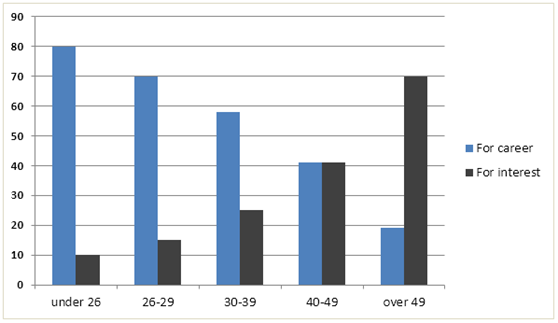
Reasons for study according to age of student
Employer support, by age group
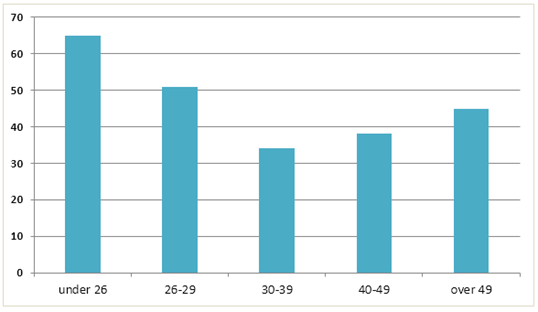
The illustrations explain why students of various ages study, as well as the assistance that their employers provided.
In general, young people pursue education primarily for professional purposes, whereas adults do so out of personal interest. Additionally, employers provided more support to younger workers in regards to their education.
People under 40 primarily study for their careers, while those over 49 primarily study for their interests, as shown by the first bar graph. Remarkably, there is an equal proportion of individuals in the 40–49 age range who study for their careers and those who study for personal interests. In order to advance their careers, 80% of students under 26 continue their education. Rather than for professional reasons, seven out of ten students over 49 enroll because of their interests.
Over 60% of students under 26 received financial aid and paid time off from their employers to further their education, as evidenced by the second bar graph. As the learners’ ages increased, this percentage of support decreased, with 32% of the 30-39 age group receiving support from their employers. Following that, employer support for workers’ education rose and eventually reached 45% for those over 49.