THE IELTS BRIDGE

IELTS Academic Writing Task 1

Last month you had a holiday overseas where you stayed with

Last month you had a holiday overseas where you stayed with some friends. They have just sent you some photos of your holiday. Write a letter to your friends. In your letter, Write at least 150 words. You do NOT need to write any addresses. Begin your letter as follows: Dear ……………, To Mark and Lucy, Wishing you continued success. …

Last month you had a holiday overseas where you stayed with Read More »

The charts below give information about travel to and from

Question – The charts below give information about travel to and from the UK, and about the most popular countries for UK residents to visit.Summarise the information by selecting and reporting the main features, and make comparisons where relevant.Write at least 150 words. The provided charts offer insights into travel patterns to and from the United Kingdom, …

The charts below give information about travel to and from Read More »

The chart below shows the different levels of post-school

Question – The chart below shows the different levels of post-school qualifications in Australia and the proportion of men and women who held them in 1999.Summarise the information by selecting and reporting the main features and make comparisons where relevant. Write at least 150 words. In 1999, Australia witnessed diverse post-school qualifications across genders, as depicted in the …

The chart below shows the different levels of post-school Read More »

The graph below shows the demancl for elecfi icity in England

Question – The graph below shows the demancl for elecfi icity in England during typical days in winter srul summer. The pie chart shows hox, electricity isused in an average English home.Summarise the information by selecting and reporting the main features,and make comparisons where relevant.Write at least 150 words. The provided graph and pie chart …

The graph below shows the demancl for elecfi icity in England Read More »

The chart below shows the amount spent on six consumer

Question – The chart below shows the amount spent on six consumer goods in four European countries. Write a report for a university lecturer describing the information shown below.You should write at least 150 words. Amount spent on consumer goods
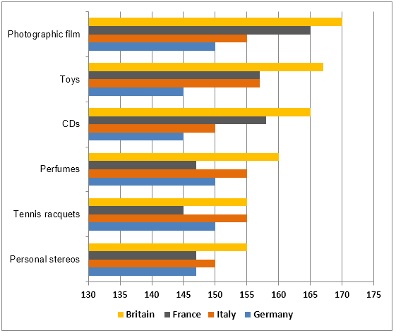
 The graph shows how much money four European countries—Britain, France, Italy, and Germany—have spent on toys, CDs, …

The chart below shows the amount spent on six consumer Read More »

The table below gives information about the underground

Question – The table below gives information about the underground railway systems in six cities.Summarise the information by selecting and reporting the main features, and make comparisons where relevant.Write at least 150 words. Underground Railways Systems The provided table lists the routes served by underground railway systems, the number of passengers who travel there each year, and …

The table below gives information about the underground Read More »

The map below is of the town of Garlsdon. A new supermarket

Question –The map below is of the town of Garlsdon. A new supermarket (S) is planned for the town. The map shows two possible sites for the supermarket.Summarise the information by selecting and reporting the main features, and make comparisons where relevant.Write at least 150 words. Two planned supermarkets are shown on the provided map of Garlsdon, …

The map below is of the town of Garlsdon. A new supermarket Read More »

The charts below show the main reasons for study among

Question – The charts below show the main reasons for study among students of different age groups and the amount of support they received from employers.Summarise the information by selecting and reporting the main features, and make comparisons where relevant.Write at least 150 words.     Reasons for study according to age of student Employer support, by age …

The charts below show the main reasons for study among Read More »

The graph below shows the proportion of the population

Question –The graph below shows the proportion of the population aged 65 and over between 1940 and 2040 in three different countries.Summarise the information by selecting and reporting the main feature and make comparisons where relevant.Write at least 150 words. The percentage of people 65 years of age or older in three different countries between …

The graph below shows the proportion of the population Read More »

The charts below give information about USA marriage

Question –The charts below give information about USA marriage and divorce rates between 1970 and 2000, and the marital status of adult Americans in two of the years.Summarise the information by selecting and reporting the main features, and make comparisons where relevant.Write at least 150 words. The first chart shows the evolution of the US marriage and …

The charts below give information about USA marriage Read More »