Category: IELTS Academic Writing Task 1

  • The Plans Below Show the Layout of a University Sports Centre Now. IELTS Cambridge 13 – Test 4 (Task 1)

    Question – The plans below show the layout of a university’s sports centre now, and how it will look after redevelopment.
    Summarise the information by selecting and reporting the main features, and make comparisons where relevant. Write atleast
    150 words.

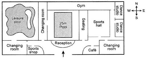
    The provided plans illustrate the current layout of a university’s sports centre and the anticipated changes after redevelopment.

    In the existing configuration, the sports facility comprises outdoor courts on both the west and east sides, with a central 25-meter pool and associated amenities like reception, changing areas, and seating near the pool. The west side also features a gym. After redevelopment, significant alterations are planned to enhance the overall sports facility.

    On the west side, the outdoor court will be replaced by a leisure swimming pool, now directly linked to a newly proposed dressing room in the extreme southwest corner. The lobby area is set to undergo expansion, and a sports store will be introduced near the changing facilities. Importantly, the central 25-meter pool and its adjacent areas will remain unchanged, ensuring continuity in the core features of the sports centre.

    Turning to the east side, the existing outdoor courts will be eliminated to accommodate new facilities. A second changing room will be constructed in the extreme southeast, connecting to a new café situated next to the sports hall. Furthermore, two dance studios are planned to be built side by side, with one adjoining the recently expanded gym. These redevelopment plans aim to offer an enhanced and diversified sports centre experience, introducing new amenities while preserving the central pool and gym areas.

  • The Bar Chart Below Shows the Top Ten Countries for the Production and Consumption of Electricity. IELTS Cambridge 13 – Test 3 (Task 1)

    Question – The bar chart below shows the top ten countries for the production and consumption of electricity in 2014. Summarise the information by selecting and reporting the main features, and make comparisons where relevant. Write atleast 150 words.

    The bar graph outlines the electricity production and consumption figures for the top ten countries in 2014, highlighting China and the United States as the primary leaders in both categories. With all countries except Germany showcasing a surplus in generation over consumption, China emerged at the forefront, producing and consuming a staggering 5,398 and 5,322 billion kWh of electricity, respectively. Following closely, the United States ranked second in both production and consumption, registering 4,099 and 3,866 billion kWh, respectively.

    Among the remaining eight nations, Russia stood out as the sole country with both production and consumption exceeding 1,000 billion kWh, reaching 1,057 and 1,038 billion kWh, respectively. Conversely, the Republic of Korea emerged as the smallest electricity-producing and consuming country, with figures of 485.1 and 449.5 billion kWh, respectively.

    In the case of Japan, India, Canada, France, Brazil, and Germany, their electricity outputs ranged from 526 to 937 billion kWh, while their consumption figures varied from 455 to 857 billion kWh.

    A noteworthy observation was that Germany was the sole country in this group to consume more electricity than it generated, recording figures of 582.5 and 526.6 billion kWh, respectively.

  • The Chart Below Shows the Percentage of Households in Owned and Rented. IELTS Cambridge 13 – Test 2 (Task 1)

    Question – The chart below shows the percentage of households in owned and rented accommodation in England and Wales between 1918 and 2011.
    Summarise the information by selecting and reporting the main features, and make comparisons where relevant. Write atleast 150 words.

    From 1918 to 2011, the bar graph delineates the shifts in the proportions of households owning and renting their residences in England and Wales.

    Over the 93-year span, there was a discernible decline in the percentage of households opting to rent, while an upward trend was observed in those choosing ownership. Pre-1971, the prevalence of renting surpassed ownership, but post-1971, this pattern reversed.

    In 1918, approximately 75 percent of households resided in rented accommodations. This figure experienced a significant plunge, reaching just over 30 percent in 2001, before a slight rebound to about 35 percent in 2011.

    In contrast, only about a quarter of households were owner-occupied in 1918. This proportion began a steady ascent, aligning with the percentage of renter-occupied households in 1971, both at 50 percent. Ownership continued its upward trajectory, peaking in 2001 at just under 70 percent. Subsequently, there was a marginal decline to around 65 percent in 2011.

  • The two maps below show road access to a city hospital in 2007 and in 2010. IELTS Cambridge 13 – test 1 (Task 1)

    Question – The two maps below show road access to a city hospital in 2007 and in 2010.
    Summarise the information by selecting and reporting the main features, and make comparisons where relevant. Write atleast 150 words.

    The presented maps illustrate the evolution of road access to a city hospital in the years 2007 and 2010.

    In 2007, the primary access point was a single road extending from the northwest, with a supplementary road connecting from the south. By 2010, significant changes occurred as a new road was introduced from the west, expanding access options. Moreover, the southern road underwent extension and now interconnected with the newly constructed western road, creating a more intricate road network.

    Comparing the two periods, a clear enhancement in road infrastructure is evident. The addition of the western road in 2010 diversified access routes, potentially alleviating congestion. The extension of the southern road further contributed to improved connectivity.

    Overall, the transformation from a simpler road layout in 2007 to a more intricate and well-connected network in 2010 signifies a positive development in the accessibility of the city hospital.

  • The charts below show the average percentages in typical meals of three types of nutrients, all of which may be unhealthy if eaten too much. IELTS Cambridge 14 – Test 1 (Task 1)

    Question – The charts below show the average percentages in typical meals of three types of nutrients, all of which may be unhealthy if eaten too much.
    Summarise the information by selecting and reporting the main features and make comparisons where relevant. Write atleast 150 words.

    Embark on a nutritional exploration as we delve into the intricacies of four standard meals through revealing pie charts. These charts meticulously outline the average amounts of three vital nutrient types—sodium, saturated fats, and added sugars. It’s crucial to note that an overindulgence in these nutrients can potentially lead to detrimental effects on one’s health.

    Considering all factors, it becomes apparent that dinner, among the four meals examined, boasts the highest levels of both saturated fat and sodium. In stark contrast, breakfast emerges as the frontrunner with the lowest amounts of these nutrients. However, breaking the mold, the snack takes center stage by showcasing the highest concentration of added sugar.

    A deeper dive into the charts uncovers that both lunch and dinner claim the top spots for the highest percentages of saturated fat, standing at 37% and 26% respectively. Similarly, in the sodium arena, dinner leads the pack with 43%, closely followed by lunch at 29%. Interestingly, when it comes to added sugars, lunch and dinner play catch-up with only 23% and 19% respectively.

    Turning our attention to the composition aspect, breakfast and the snack share a common ground, each containing 14% sodium. However, the snack slightly edges out breakfast in saturated fats, registering a marginally higher 21% compared to the latter’s 16%. A notable distinction surfaces in the realm of added sugars, where breakfast commands a substantial 42%, in stark contrast to the snack’s more modest 16%.

    In navigating these nutrient percentages, it becomes abundantly clear that our meal choices wield significant influence over our nutritional intake. Stay tuned for further insights into crafting a balanced and health-conscious diet!

  • The chart below shows the value of one country’s exports in various categories during 2015 and 2016. The table shows the percentage change in each category of exports in 2016 compared with 2015. IELTS Cambridge Test 14 – Test 2 (Test 1)

    Question – The chart below shows the value of one country’s exports in various categories during 2015 and 2016. The table shows the percentage change in each category of exports in 2016 compared with 2015.
    Summarise the information by selecting and reporting the main features, and make comparisons where relevant. Write atleast 150 words.

    A country\’s export values in five categories are shown in a bar graph for comparison\’s sake, while a table shows the percentage change in export values for the same five categories from 2015 to 2016.

    With the exception of jewelry and gems, all categories saw an increase in export revenue in 2016. The export of textiles increased at the highest percentage that year.

    In both years, the two most valuable exports were petroleum products and engineered goods, with respective values of approximately $61 and $58 billion in 2015 and approximately $62 billion in 2016. Agricultural and textile exports both increased, reaching almost $31 billion. In contrast, only the gem and jewelry industry saw a decline in export value, going from approximately $44 billion to $41 billion.

    Textile exports, at 15.24%, had the biggest value growth of the five export categories. The export values of engineered goods, petroleum products, and agricultural products increased by 8.5%, 3%, and 0.81%, respectively, after this. In contrast, there was a 5.18% decline in the value of gems and jewelry exported.

  • The diagram below shows how electricity is generated in a hydroelectric power station. IELTS Cambridge 14 – Test 3 (Task 1)

    Question – The diagram below shows how electricity is generated in a hydroelectric power station.
    Summarize the information by selecting and reporting the main features, and make comparisons where relevant. Write at least 150 words.

    \"\"

    The flowchart illustrates how a hydroelectric power plant generates electricity. The transfer of electricity to the national grid completes the process, which started when river water entered a high-level reservoir.

    The process is divided into day and night phases, with the daylight phases entailing the generation of electricity from a river and the reservoir\’s water storage. The water returns in the opposite direction at night, flowing into the river and the first reservoir.

    River water is channelled into a high-level reservoir supported by a dam during the process\’s day phase. An intake area that opens in the daytime and closes at night leads to the power station. The power station\’s turbines use the flow of water during the day to produce electricity. Next, the excess water flows to a low-level reservoir while the generated electricity is transmitted via power lines to the national grid.

    In the night stage, the water in the low-level reservoir is pumped back to the power station via the generator\’s turbines, filling the high-level reservoir, which is closed at night. After being stored at the upper level, the river water eventually flows down to restart the cycle.

  • The plans below show a public park when it first opened in 1920 and the same park today. IELTS Cambridge 14 – Test 4 (Task 1)

    The maps show the general evolution of Grange Park on Arnold Avenue over two distinct time periods: the first shows the park at the time of its opening in 1920, and the second shows its current configuration.

    The park\’s general layout has undergone significant changes, with the exception of the main entrances located at Arnold Avenue and Eldon Street.

    Since its initial opening in 1920, the park has undergone significant development. First off, the park\’s focal point—the central fountain—has been destroyed. The rose garden and seating areas were formerly dispersed throughout the park\’s perimeter, but they have since been moved to the park\’s center. To accommodate a larger audience, the musicians\’ stage has been further transformed into a \”Amphitheatre\” for concerts. The rose garden on the northwest side has been kept, though.

    In addition, the southeast-facing glasshouse has undergone renovations to include a water feature and a visitor parking lot underground entrance. It was also completed to add amenities, like the cafe next to Arnold Avenue on the northeast side. Lastly, a children\’s play area was added to the water plant pond through redesign.

  • The chart below shows the results of a survey about people\’s coffee and tea buying and drinking habits in five Australian cities. IELTS Cambridge 15 – Test 1 (Task 1)

    This bar graph unveils intriguing insights into tea and coffee consumption habits across five Australian cities: Adelaide, Brisbane, Hobart, Melbourne, and Sydney. Instant coffee and fresh coffee emerged as the top choices, closely followed by coffee and tea enjoyed at cafes.

    Sydney, Melbourne, and Hobart led in cafe preferences, each surpassing 60%. Brisbane trailed with slightly over 55%, while Adelaide reported around 50%. Brisbane and Hobart exhibited the highest affinity for instant coffee, both hovering near 55%. Adelaide ranked second, with 50%, marking its predominant choice. Sydney and Melbourne, conversely, showed lower instant coffee preferences, with just over 45% each.

    Fresh coffee enthusiasts were most abundant in Sydney and Melbourne, with approximately 43% each. Brisbane and Adelaide trailed with around 35%, while Hobart secured the second spot with roughly 40%.

    This data not only provides a snapshot of beverage preferences but also paints a vivid picture of regional variations in tea and coffee consumption across these vibrant Australian cities. Explore the nuances of coffee culture and regional preferences in this visually compelling breakdown.

  • The graph below shows the number of tourists visiting a particular Caribbean Island between 2010 and 2017. IELTS Cambridge 15 – Test 2 (Task 1)

    Discover the captivating tourism trends of a specific Caribbean island over a seven-year period, commencing in 2010, vividly illustrated in the accompanying line graph.

    Throughout this duration, there\’s a discernible surge in the overall tourist influx to the Caribbean Island, portraying its growing popularity. Notably, the preference for staying on the island outpaced that of opting for cruise ship accommodations.

    In 2010, the Caribbean Island hosted a million tourists, with seventy-five thousand opting for an island stay, while the rest favored cruise ship experiences. Over the next two years, cruise ship stays experienced a slight dip to just under 0.25 million. In contrast, island stays continued to be the preferred choice, attracting 1.25 million visitors.

    The most remarkable shift occurred in the final year, witnessing a staggering 3.5 million visitors to the Caribbean Island. Simultaneously, cruise ship enthusiasts surged to almost 2 million, surpassing island stays by half a million. This data not only reflects the island\’s burgeoning tourism but also reveals an evolving preference, showcasing the allure of cruise ship adventures in the latter years of this compelling seven-year narrative. Dive into the evolving travel choices that shaped the Caribbean Island\’s tourism landscape over this intriguing period.