Category: IELTS Academic Writing Task 1

  • The graph below shows the quantities of goods transported

    Question – The graph below shows the quantities of goods transported in the UK between 1974 and 2002 by four different modes of transport.
    Summarise the information by selecting and reporting the main features, and make comparisons where relevant. Write at least 150 words.

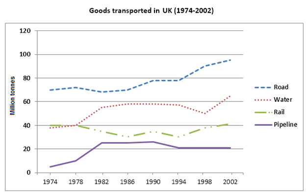
    From 1974 to 2002, the line charts illustrate the four distinct transportation modes in the UK: road, rail, water, and pipeline quality. The charts quantify the amount of goods transported in million tonnes.

    In the UK, roads and waterways surpassed pipelines and railroads in the overall amount of goods carried. Rail and water transport accounted for 40 million tonnes in 1974, remaining constant for four years, while road transportation dominated with 70 million tonnes. Following a notable fluctuation, the water mode peaked at 62 million tonnes in 2002, marking an increase of about 19 million tonnes since 1978 and remaining stable for 12 years. However, rail transport experienced a slight decline after four years of consistent demand, reaching 30 million tonnes in 1986. After a period of gradual fluctuation, it returned to the same million tonnes in 2002 as in the initial year. Additionally, the road stands out as the primary mode of transportation, showing growth.

    Pipelines were less preferred initially, with only 1 million tonnes in 1974. This amount increased to 21 million in 1982, maintaining stability for a decade before dropping to just 1 million in 1994 and remaining unchanged for an additional period.

    Significantly, there was an 80 million-tonne difference between 1990 and 1994, with 22 million tonnes more in 2002 than in 1974.

  • The diagrams below show the stages and equipment

    Question – The diagrams below show the stages and equipment used in the cement-making process, and how cement is used to produce concrete for building purposes.
    Summarise the information by selecting and reporting the main features, and make comparisons where relevant.

    Write at least 150 words.

    The drawings illustrate the process of manufacturing cement and showcase an application where cement is used to create concrete for construction purposes.

    To produce cement, operators begin by combining raw materials like limestone and clay, which are then processed in a crusher. The resulting mixture is carefully blended to achieve the optimal combination. Following this, the mixture undergoes a heating process through rotation. Heat is applied from the end of the rotating heater tube before the blend is discharged onto the grinder. After completing the systematic process, the mixture transforms into cement and is subsequently sealed into bags.

    Simultaneously, a concrete mixer is employed to blend materials such as gravel, cement, water, and sand to create concrete. Among these materials, gravel or small stones constitute 50%, making it the most crucial component. Additional materials, including sand, which is the second most commonly used material after gravel, along with cement and water, contribute to the mix. Cement comprises 15% of all the materials required for constructing a new building. The concrete mixer efficiently combines all these materials.

    In essence, the production of concrete involves the straightforward mixing of necessary ingredients in the correct ratio using a simpler machine. On the other hand, manufacturing cement entails a more intricate process with multiple steps and sophisticated equipment. It’s essential to note that concrete production necessitates heat, which must be introduced into the mixture during the mixing process.

  • The three pie charts below show the changes in annual spending

    Question – The three pie charts below show the changes in annual spending by a particular UK school in 1981, 1991 and 2001.
    Summarise the information by selecting and reporting the main features, and make comparisons where relevant. Write at least 150 words.

    The three distinct years of 1981, 1991, and 2001 are represented by pie charts that show the overall information regarding the change in annual spending at a particular UK school. All things considered, when it came to expenditures in the years under consideration, the portion of educators’ paychecks was the highest. In contrast, insurance contributed the least in terms of actual financial outlay.

    First off, in 1981, the salary of educators was precisely forty percent. It rose to half of the total expenditure ten years later. Nonetheless, expenditure in the same category decreased slightly to 45% in 2001.

    Furthermore, after the salaries of educators, the salaries of other employees also revealed a significant budgetary proportion. Between 28% in 1981, 22% in 1991, and only 15% in 2001, this area saw a slight decline in the observed years.

    Nonetheless, one field saw a steady improvement in yearly spending. The one that kept going up was insurance. In 1981, 1991, and 2001, the corresponding percentages were 2%, 3%, and 8%. Between 1991 and 2001, there was a notable 5% increase in improvement. Insurance, however, continued to be the least expensive sector in terms of spending.

  • The pie chart below shows the main reasons

    Question – The pie chart below shows the main reasons why agricultural land becomes less productive. The table shows how these causes affected three regions of the world during the 1990s.
    Summarise the information by selecting and reporting the main features, and make comparisons where relevant. Write at least 150 words.

    A table that compares the degradation of agricultural land by region in the 1990s—including North America, Europe, and Oceania—and a pie chart that is divided into four sections show the main causes of agricultural land degradation worldwide.

    Overgrazing accounted for 35 percent of the total causes of land degradation, with deforestation coming in second with only five percent. The third main factor contributing to agricultural land degradation is overcultivation. The remaining factors only account for 7% of the chart, with each of the three reasons occupying approximately the same equation.

    With most of the land degraded due to deforestation, Europe has the worst degradation when compared to the other two regions. The two primary causes of the less productive agricultural land in Oceania, which has a total degradation rate of 13 percent, are overgrazing and deforestation. The table indicates that overcultivation, however, has no effect on the land in Oceania.

    According to the table below, North America has the least degraded land. According to this, over-cultivation accounted for 3.3 percent of the total land degradation in the 1990s, or only 5% of the land degradation.

  • The graph below gives information from a 2008 report about consumption of energy in the USA since 1980 with projections until 2030. IELTS Cambridge 9-Test 4 (Task 1)

    Question – The graph below gives information from a 2008 report about consumption of energy in the USA since 1980 with projections until 2030.
    Summarise the information by selecting and reporting the main features, and make comparisons where relevant.
    Write atleast 150 words.

    The 2008 report graphically portrays the evolving energy consumption trends in the USA from 1980 to 2005, projecting trends until 2030. The primary features illuminate transitions in energy sources and consumption patterns.

    In 1980, conventional sources, predominantly coal, oil, and natural gas, constituted the majority of energy. Coal consumption witnessed a significant decrease over the years, giving way to a growing reliance on natural gas. By 2005, natural gas had surpassed coal as the second-largest energy source, while oil retained its dominance.

    Projections for 2030 anticipate a continued decline in coal consumption, with natural gas poised to become the leading energy source. Renewable energy, a minor fraction in 2005, is expected to experience substantial growth, making a significant contribution to the overall energy mix.

    In summary, the graph highlights a shift towards cleaner energy sources, with natural gas and renewables taking center stage. The diminishing role of coal aligns with a broader global trend towards embracing sustainable and environmentally friendly alternatives.

  • The charts below give information on the ages of the populations of Yemen and Italy in 2000 and projections for 2050. IELTS Cambridge 9-Test 3 (Task 1)

    Question – The charts below give information on the ages of the populations of Yemen and Italy in 2000 and projections for 2050.
    Summarise the information by selecting and reporting the main features, and make comparisons where relevant. Write at least 150 words.

    The charts offer insights into the age distribution of Yemen and Italy in 2000, along with projections for the year 2050.

    In 2000, Yemen had a relatively young population, with about 43% constituting a substantial percentage under the age of 15. Meanwhile, Italy exhibited a more balanced age distribution, with approximately 63% of the population in the working-age range between 15 and 59 years.

    Looking ahead to 2050, projections unveil notable demographic shifts. Yemen expects to undergo a demographic transition, anticipating a decline in the younger population and a considerable increase in the elderly segment. The percentage of those aged 65 and above is expected to rise significantly, reaching around 20%. On the contrary, Italy envisions a more pronounced aging trend, projecting the elderly population to surge to nearly 40%, signifying a considerable shift from its more balanced age structure in 2000.

    In summary, the charts depict a stark contrast in the age demographics of Yemen and Italy in 2000, with distinct shifts foreseen by 2050. Yemen anticipates a move towards an older population, while Italy foresees a substantial increase in the elderly segment, highlighting the evolving dynamics in these two nations.

  • The chart below shows the total number of minutes (in billions) of telephone calls in the UK, divided into three categories, from 1995-2002. IELTS Cambridge 9-Test 2 (Task 1)

    Question – The chart below shows the total number of minutes (in billions) of telephone calls in the UK, divided into three categories, from 1995-2002.
    Summarise the information by selecting and reporting the main features, and make comparisons where relevant.
    Write at least 150 words.

    Examine the bar graph to observe the billions of minutes spent on phone conversations in Britain from 1995 to 2002. Local fixed-line calls dominated overall call types during this period, with a noticeable surge in cell phone usage in subsequent years.

    After four years, local call duration steadily rose to approximately 90 billion minutes from the 1995 figure of 70 billion minutes. However, the span of local calls quickly decreased to a range between 70 and 80 billion. In stark contrast, national and international fixed-line and mobile calls collectively exhibited upward trends.

    It is evident that the volume of fixed-line calls, both national and international, experienced a gradual increase from less than 40 to 60 billion in 2002. Meanwhile, mobile call volume showed a gradual increase in the first five years before rapidly surpassing 40 billion minutes.

    Remarkably, over an eight-year period, local fixed-line calls remained the most prevalent of the three call types in the UK.

  • The two maps below show an island, before and after the construction of some tourist facilities. IELTS Cambridge 9-Test 1 (Task 1)

    Question – The two maps below show an island, before and after the construction of some tourist facilities.
    Summarise the information by selecting and reporting the main features, and make comparisons where relevant. Write at least 150 words.

    The maps illustrate changes resulting from construction on the island, showing transformations before and after various renovations aimed at enhancing the tourist experience. Developers have executed the creation of extensive tourism infrastructure, including restaurants, lodging facilities, swimming pools, and other amenities, with minimal impact on the environment.

    Before implementing these facilities, the island was mostly deserted, retaining only the beach and trees. Subsequently, developers erected numerous new tourist amenities, such as lodging options, dining establishments, a reception area, a boat dock, and designated beach swimming areas. Notably, most constructions are in close proximity to the beach, and developers did not sacrifice any trees or plants for their creation.

    Moreover, to enhance accessibility for visitors, developers have constructed roads and walking pathways. Footpaths connect lodging areas to the beach, while motorways offer convenient access to the restaurant, reception area, and boat dock.

    In summary, construction endeavors prioritized preserving the natural environment, with no cutting down of trees or plants. The primary objective was to ensure a seamless and enjoyable experience for visitors during their stay and exploration of the island.

  • The diagrams below show the life cycle of a species of large fish called the salmon.IELTS Cambridge 10 -Test 4 (Task 1)

    Question- The diagrams below show the life cycle of a species of large fish called the salmon.
    Summarise the information by selecting and reporting the main features, and make comparisons where relevant.Write atleast 150 words.

    The diagrams illustrate the intricate life cycle of a species of large fish known as the salmon. Comprising multiple stages, the life cycle showcases the salmon’s remarkable journey from egg to maturity.

    Initially, the process commences with the spawning of eggs in freshwater. Subsequently, the eggs undergo an incubation period, developing into alevins. These alevins, characterized by their distinctive appearance with a yolk sac, then emerge and transform into fry. The fry stage witnesses the salmon assuming a more recognizable fish form, characterized by increased mobility.

    As the fry matures, it transitions into the parr stage, marked by the development of more defined features. Following this stage, the salmon undergoes a crucial physiological change known as smoltification, where it adapts to the transition from freshwater to saltwater environments. The matured salmon then embarks on a journey downstream to the ocean, where it reaches adulthood and engages in the complex process of spawning, thus completing the life cycle.

    Comparatively, the diagrams highlight the multifaceted nature of the salmon’s life cycle, emphasizing its adaptability to both freshwater and saltwater environments. The visual representation effectively captures the stages of egg, alevin, fry, parr, smolt, and adult salmon, providing a comprehensive overview of this awe-inspiring natural process.

  • The charts below show what UK graduate and postgraduate students who did not go into full-time work did after leaving college in 2008. IELTS Cambridge 10-Test 3 (Task 1)

    Question – The charts below show what UK graduate and postgraduate students who did not go into full-time work did after leaving college in 2008.
    Summarise the information by selecting and reporting the main features, and make comparisons where relevant. Write at least 150 words.

    The charts provide insights into the choices made by UK graduate and postgraduate students who did not pursue full-time work after leaving college in 2008. The data reveals diverse avenues that these individuals explored in the pursuit of their career aspirations.

    In 2008, a significant portion of both graduate and postgraduate students opted for further studies, with 45% and 55% respectively choosing to continue their education. Another prominent choice for graduates was temporary employment, with 30% engaging in part-time or voluntary work.

    On the other hand, postgraduates leaned towards temporary employment less, with only 20% opting for this route. Notably, a considerable number of both groups, 20% of graduates and 25% of postgraduates, engaged in other activities not specified in the charts.

    The data indicates a divergence in the post-college paths of graduates and postgraduates in 2008, showcasing varied preferences and pursuits among individuals who did not immediately enter full-time work. The choices made by these students reflect the complexity and diversity of career trajectories in a rapidly changing professional landscape.